CSC316 Project
Flight Risk
One dataset. Many stories. We drew where, when, and why planes have crashed—like sending postcards from the data.
CSC316 Project
One dataset. Many stories. We drew where, when, and why planes have crashed—like sending postcards from the data.
This project is a visual correspondence with aviation incident data.
Each section is
a postcard, a question we asked of the data and the picture we drew in response.
Scroll through the
story.
Postcard 1 — What are we blaming?

Tap to flip postcard
We started by asking: when something goes wrong, what does the report say? Technical failure, weather, human factor, or unknown. This sketch is our first draft of that answer.
Each bubble represents a root-cause category assigned to crashes in the dataset. Bubble size reflects the number of crashes. Hover to see the exact count and overall share.
Postcard 2 — Where and when?
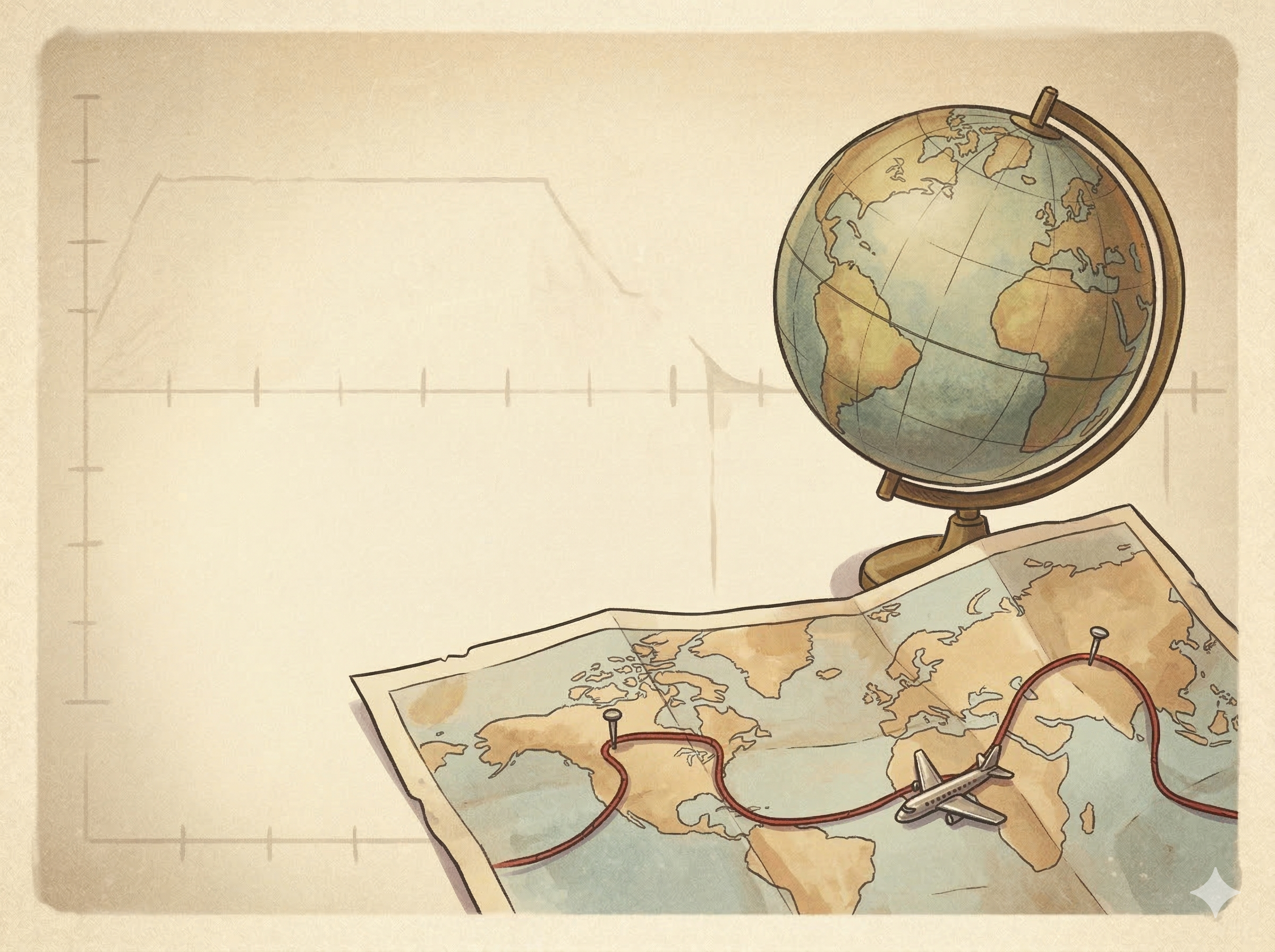
Tap to flip postcard
On the left, a globe that fills with crash points as you move through time. On the right, a line being drawn year by year, with a tiny plane tracing the amount of crashes.
Drag to rotate · Scroll to zoom · Animate with Play
Drag to change year
Click on a crash point to see details
Use Play or move the year slider to see the most fatal crash for each year.
Do you notice a huge spike around 1944? The second world war began in 1939 and ended in 1945. I wonder if that has anything to do with it?
Postcard 3 — The official reason

Tap to flip postcard
From the same dataset we counted how often each “Crash cause” appears. Technical failure and Unknown lead; we leave the interpretation to you.
Postcard 4 — Takeoff, cruise, or landing?
Tap to flip postcard
We observed crashes from 1982 to 2019 and grouped them by flight phase. The size of each bubble is the number of crashes in that phase. Landing and takeoff stand out.
Postcard 5 — Which machines?
Tap to flip postcard
We drew each aircraft type as a circle; the more crashes, the bigger the bubble. Hover to see the count.
Postcard 6 — Where on the plane?
Tap to flip postcard
Based on a crash study, we mapped where survivors were found in different sections of the aircraft. The color shows relative fatality risk, i.e. darker zones had fewer survivors. Hover over the text to see the details.
Postcard 7 — When the sky turns
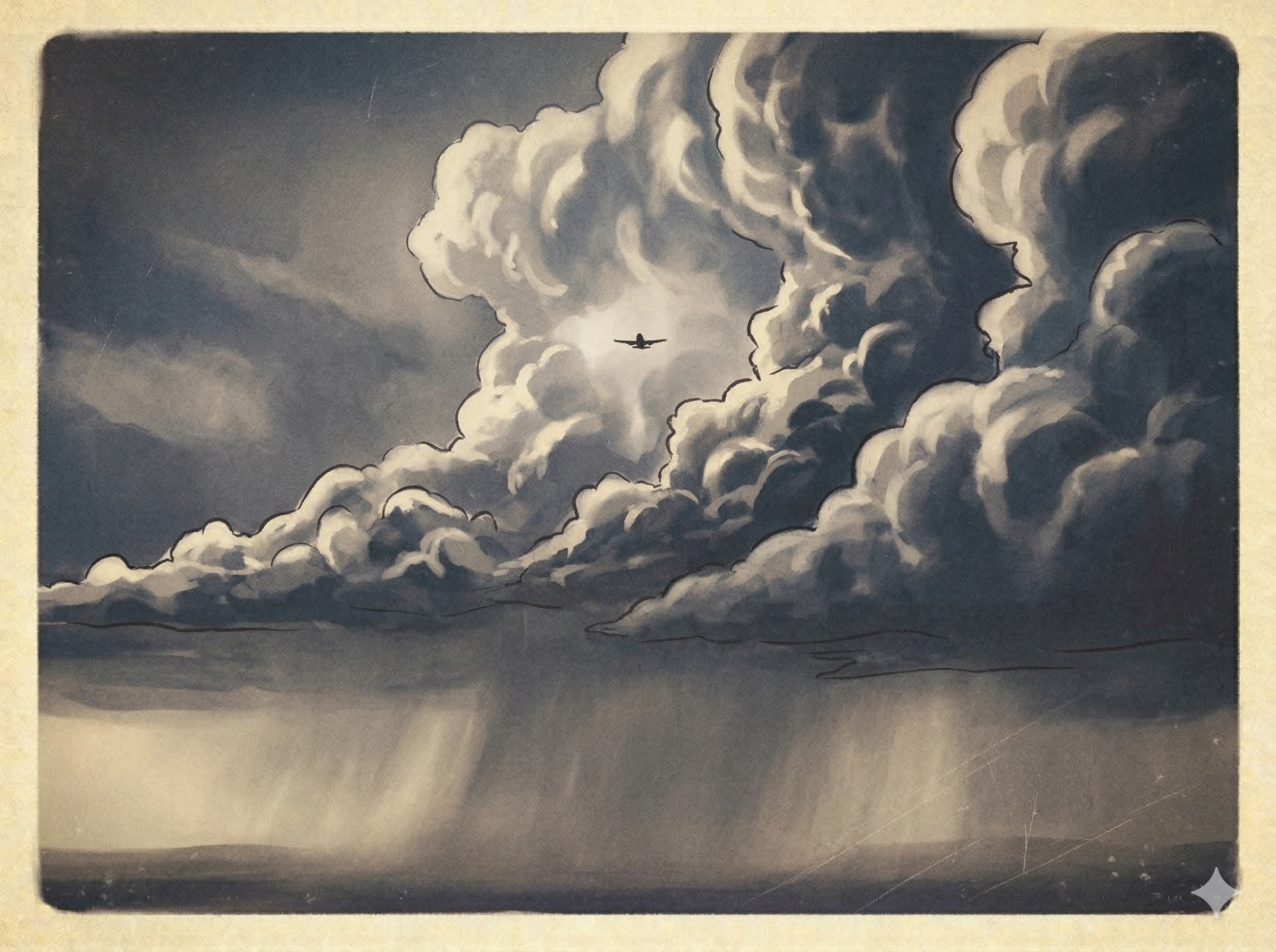
Tap to flip postcard
We wondered how often weather is named. This interactive visualization is our idea of that relationship—another angle on the same data.
Number of crashes categorized by weather condition. The distance of the plane from the axis represents the total frequency. Hover over the plane to see the exact count!
End of our data postcards. Visualizations in this project are meant to show observed patterns in available data, not definitive conclusions about all aviation safety. — Team Flight Risk